Working with Layout, Columns, Cobbles and Spacing
Learn how to use Essential Grid's layout tools in this guide.

Table of Contents
Designing Grid Layouts
Essential Grid gives you a great deal of flexibility when designing the layout of your grids.
In this guide will be stepping through the core tools you are provided with to control layout, all found within four layout related panels in the Grid Settings tab: Layout, Cobbles, Columns and Spacings.
Layout Panel
The Layout panel is the first one in the Grid Settings tab, and gives you a collection of high-level layout options to work with:
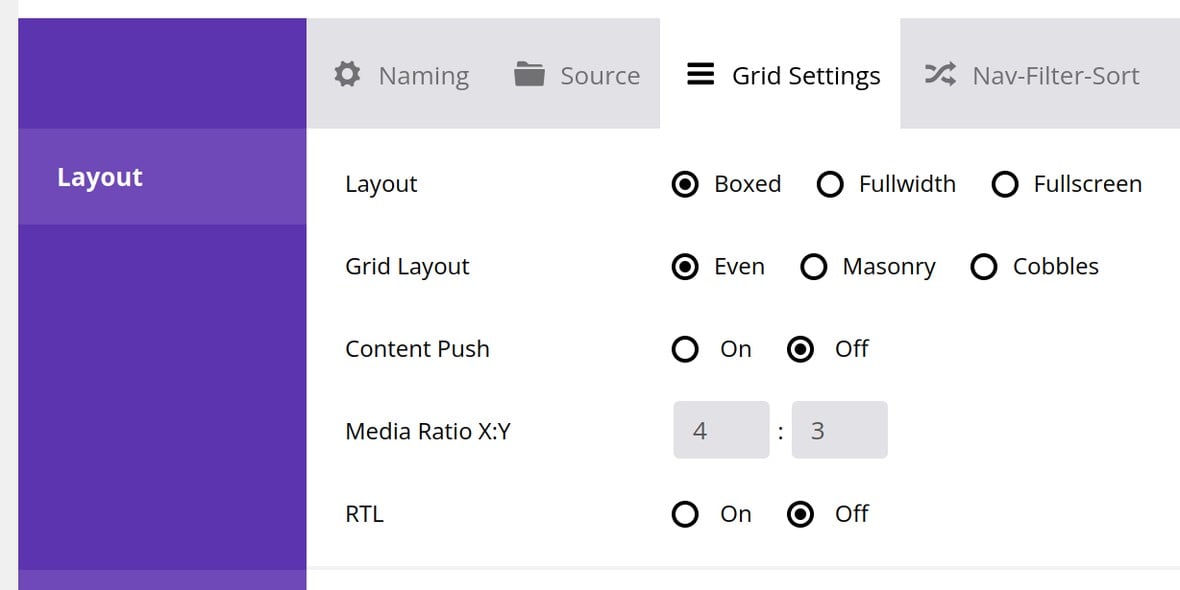
Let’s step through what each option does and how to configure it.
Layout
The Layout option determines how the outer container of a grid is sized within your content:

Three options are available: Boxed, Fullwidth and Fullscreen
Boxed
A boxed grid fits itself to the container in which it sits.
For example if you add a grid to a post it will be the same width as the rest of the post:
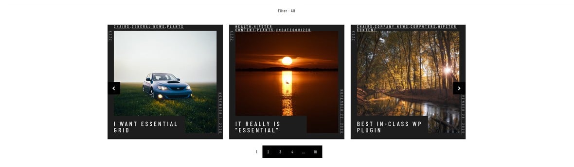
The grid’s width, however, will depend on the height of your rows and how many rows there are.
Fullwidth
A full width grid expands itself to the size of the browser viewport:
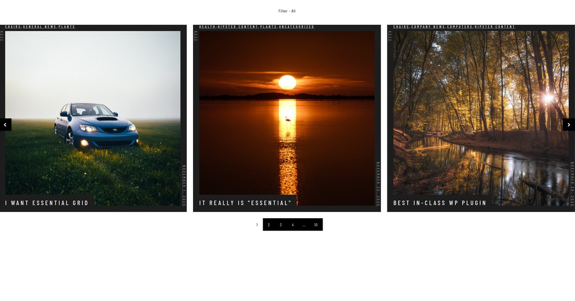
Like a boxed grid, its height will depend on row height and count.
Fullscreen
A full screen grid expands its size to match both the width and height of the browser viewport:
In this mode, regardless of how many rows there are, they will be stretched or compressed so as to fit the height matching the viewport.
Grid Layout
The Grid Layout option controls how the grid items themselves will be sized:

Three options are available: Even, Masonry and Cobbles.
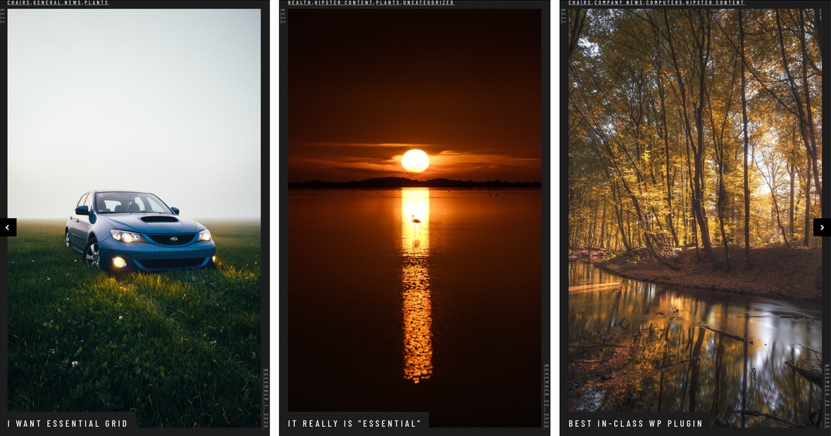
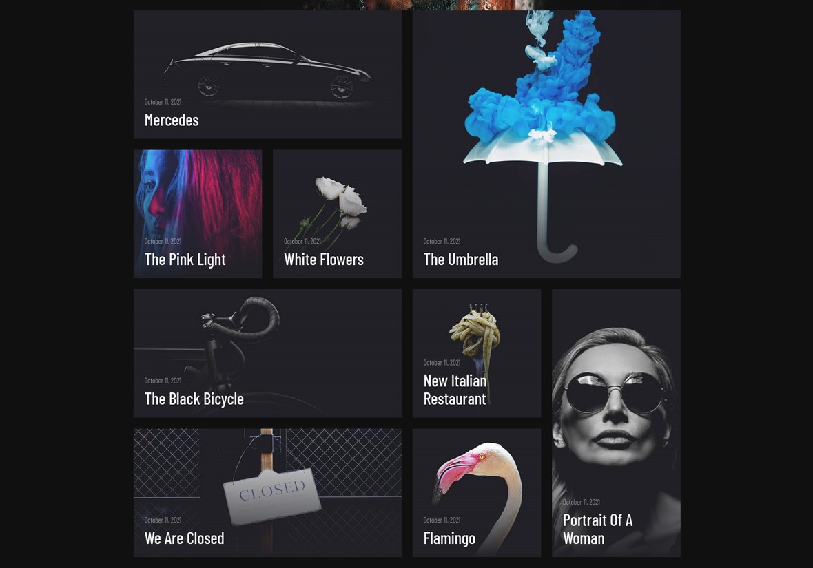
Even
In an even grid layout all items have exactly the same width and height:

Masonry
In a masonry grid layout all the items have the same width, but may have different heights:
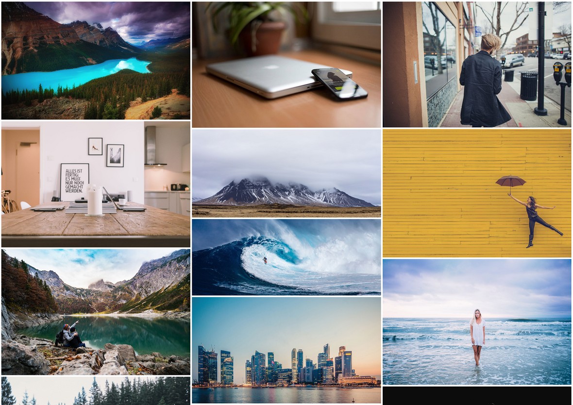
Cobbles
In a cobbles grid layout items can have different heights and widths.
However, these heights and widths are still constrained, in that their dimensions are defined by the number of rows and columns they span:
Note: The Cobbles option is only available when using a boxed or full width layout type.
Content Push
The Content Push option becomes useful if you have an Even grid with items that become larger when you hover over them. It determines what happens to nearby website content when you hover over items on the bottom row of the grid.

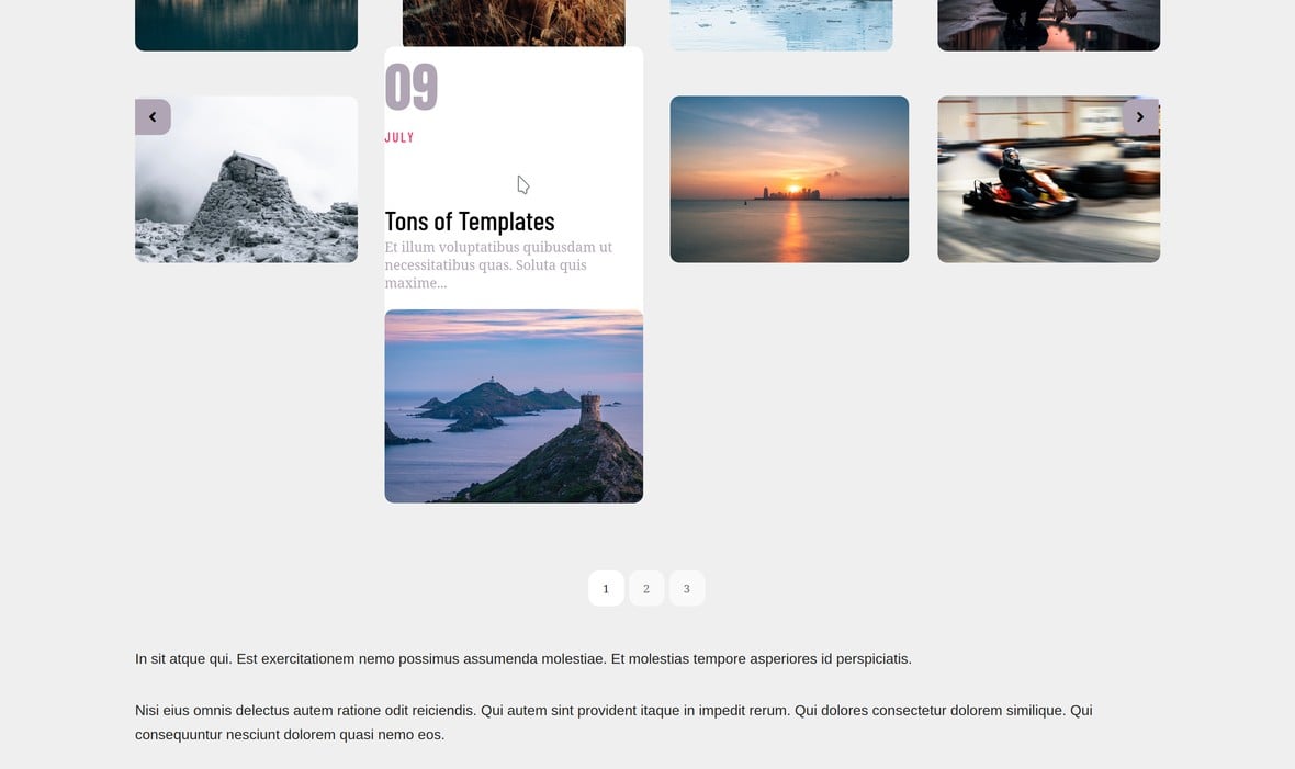
If you set Content Push to Off, when you hover over a bottom row item it will overlap any website content placed immediately below the grid:

If you set Content Push to On, the hovered item will instead push any content below it further down:
Note: The Content Push option is available only if Grid Layout is set to Even, and Layout to either Boxed or Fullwidth.
Media Ratio X:Y
The Media Ratio X:Y option controls the aspect ratio of a grid’s media, i.e. the images or videos that appear in a grid item:

The first field sets the media’s width, and the second field sets the height. For example, if you have a grid that will be showing a collection of 16:9 videos, you may wish to change the media ratio to also be 16:9.
RTL
Setting the RTL option to On makes column order flow from right to left:

Row order is unchanged.
Cobbles Panel
The Cobbles panel contains two options that help you configure grids using a cobbles layout:
Let’s see what these two options do.
Note: This panel will only be visible if the Grid Layout option is set to Cobbles.
Even Layout on Device
Through this option you can determine if the cobbles layout should switch to an even layout under certain conditions. This can be useful in scenarios where a cobbles layout doesn’t comfortably fit on smaller viewports.
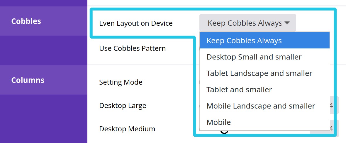
The available settings, and what they mean, are as follows:
Keep Cobbles Always
Never switch to an even layout at any viewport size, always maintain the cobbles layout.
Desktop small and smaller
Switch to an even layout if the viewport is narrower than 1170px.
Approximates the width of a small desktop device.
Tablet landscape and smaller
Switch to an even layout if the viewport is narrower than 1024px.
Approximates the width of a tablet in landscape orientation.
Tablet and smaller
Switch to an even layout if the viewport is narrower than 960px.
Approximates the width of a tablet in portrait orientation.
Mobile landscape and smaller
Switch to an even layout if the viewport is narrower than 778px.
Approximates the width of a mobile/cell phone in landscape orientation.
Mobile
Switch to an even layout if the viewport is narrower than 640px.
Approximates the width of a mobile/cell phone in portrait orientation.
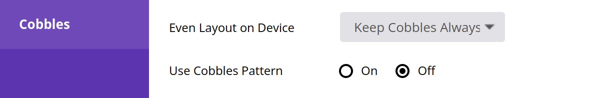
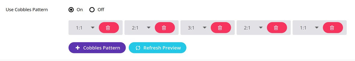
Use Cobbles Pattern
When set to On, this option allows you to build up a cobbles pattern item by item through clicking the + Cobbles Pattern button, then choosing how many columns and rows you wish an item to span. For example, 2:1 means an item will span 2 columns and 1 row.
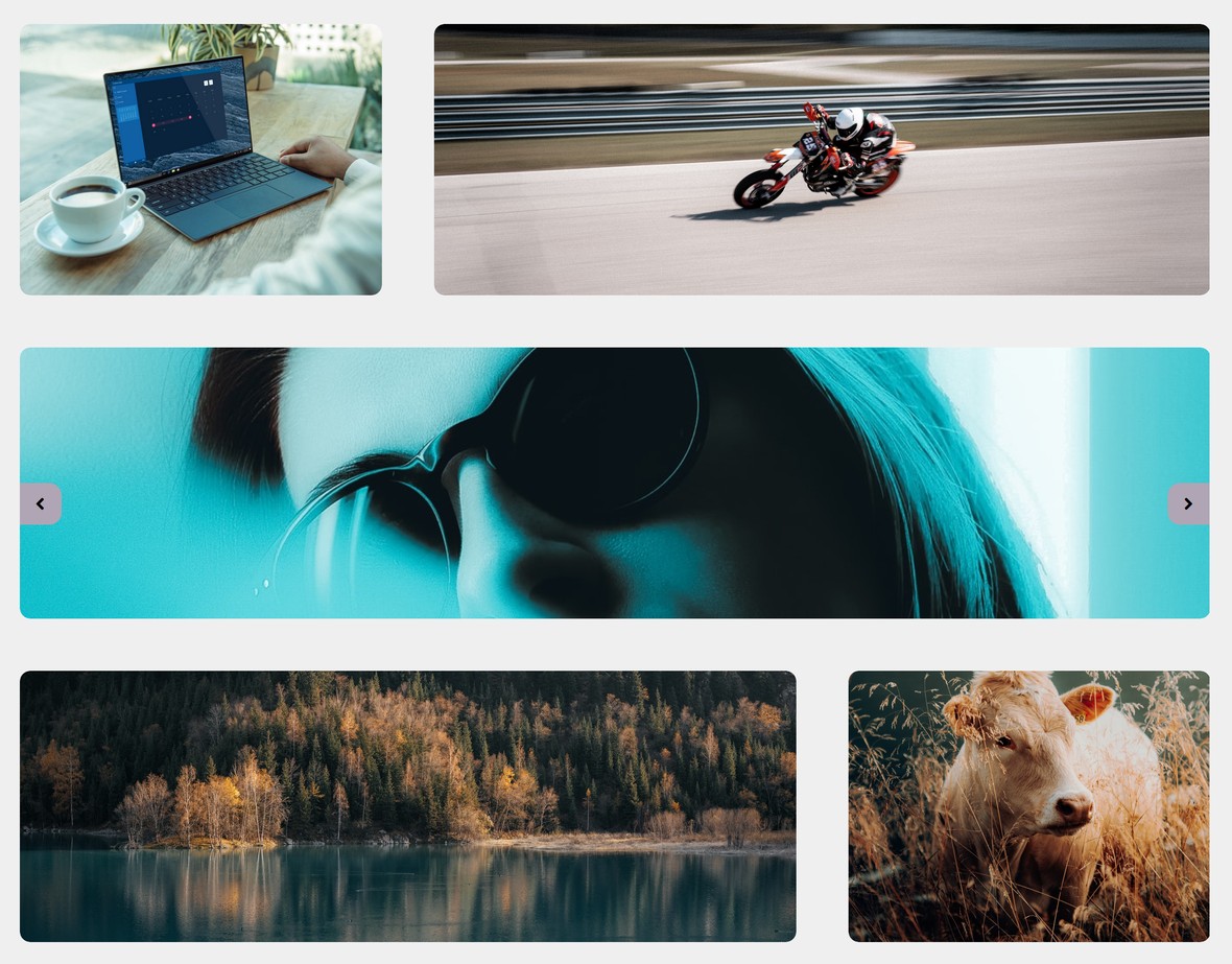
The cobbles pattern pictured above would look like this in a grid:
Columns Panel
The Columns Panel allows you to set how many columns your grid should have at various viewport sizes.
Note: The panel has two modes: Advanced and Simple. For the purposes of this tutorial we’ll just cover the Simple setting mode. We’ll talk about how to use the Advanced setting mode later on in the manual when we cover other advanced topics.
In simple mode, this panel will display a collection of seven options, each one representing how many columns the grid should have at a particular viewport size:
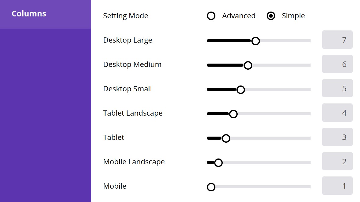
You can set the number of columns for one of these options either by dragging its slider or directly entering a number into the text field.
Each option approximates the width of a different device type. The specific width range each corresponds with is as follows:
- Desktop Large =
1400pxand wider - Desktop Medium =
1170px–1139px - Desktop Small =
1024px–1169px - Tablet Landscape =
960px–1023px - Tablet =
778px–959px - Mobile Landscape =
640px–777px - Mobile =
639pxand narrower
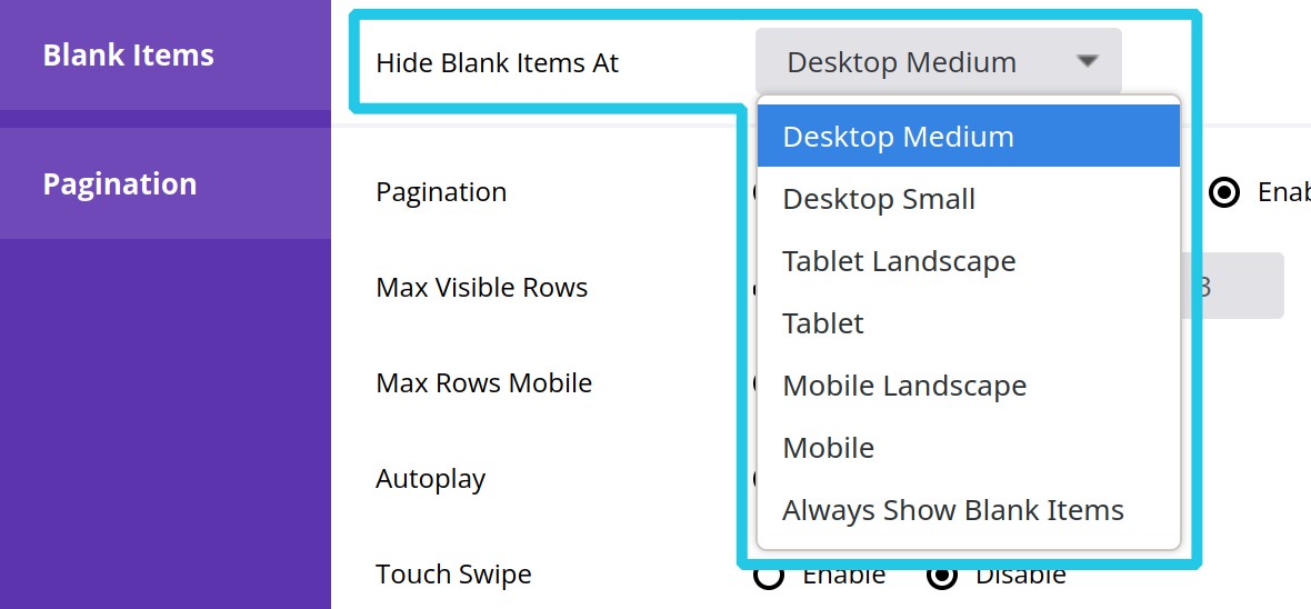
Blank Items
If your grid uses the Custom Grid source type and has any blank items in it, you’ll see an additional panel named Blank Items below the Columns panel.
In this panel you can use the Hide Blank Items At option to set if, and at what size, your blank items should be hidden from view:
The settings availabile in the dropdown are sizes that correspond with those listed in the above section on the Columns panel.
Spacing Panel
The Spacings panel has two options, Item Spacing and Grid Padding, that between them allow you to control the spacing between your grid items and around your grid:
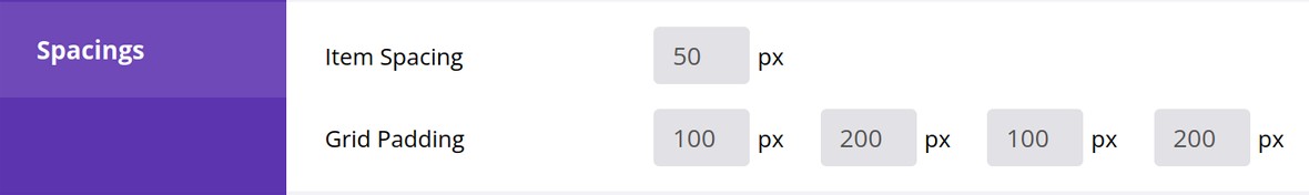
Item Spacing
The Item Spacing option controls the amount of space, in pixels, in between the items of your grid, both horizontally and vertically:

Grid Padding
The Grid Padding options control how much space, in pixels, there is around the outside of your entire grid.
There are four fields and they control, in order, the top spacing, right spacing, bottom spacing, and left spacing:

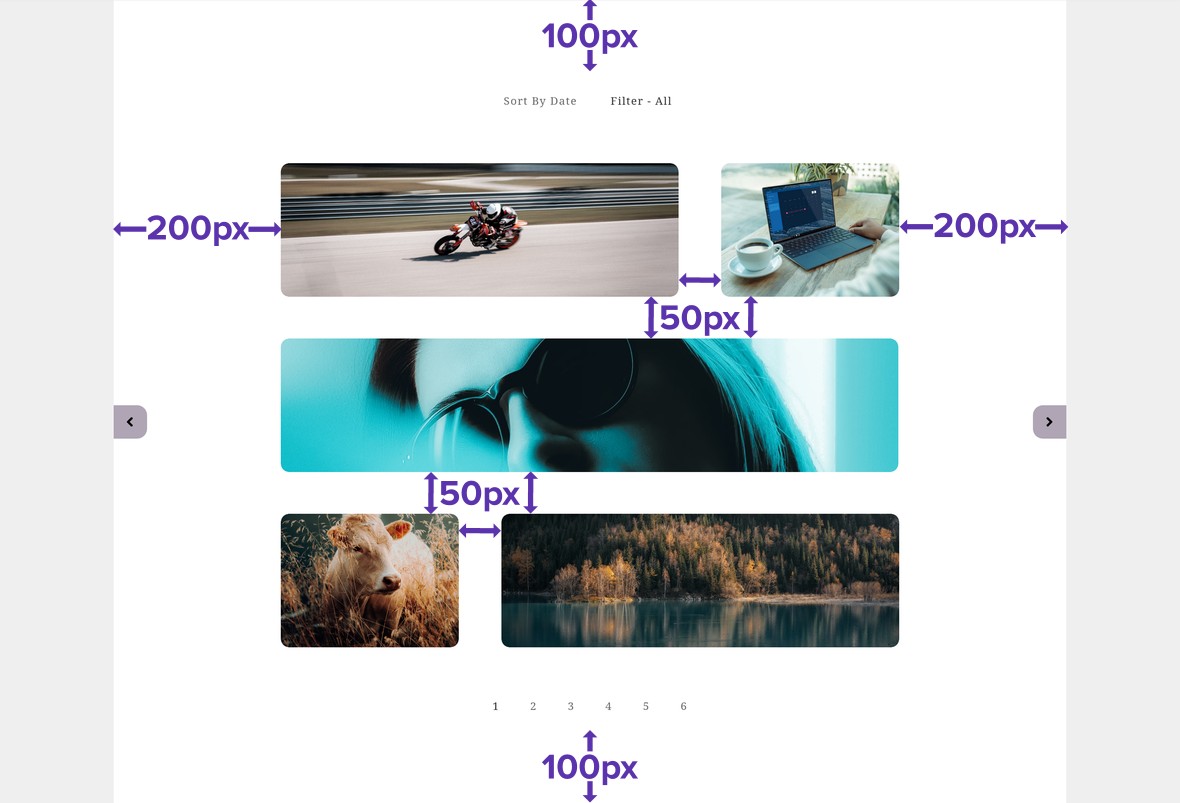
With the spacings settings used in the screenshots above, a grid would have spacing that looks like this:
Up Next: Media Playback
On the next page of the manual will move on to learning how to use the media playback panel.
We’ll see how to control when videos play back, where they play back, whether or not they loop, and whether or not they have inline controls.
